Forum › Forums › Discussion › PotD 3D Radar
This topic contains 10 replies, has 7 voices, and was last updated by ![]() Miqobot 9 years, 6 months ago.
Miqobot 9 years, 6 months ago.
-
AuthorPosts
-
September 30, 2016 at 5:02 pm #2195October 1, 2016 at 2:37 am #2201
Indeed, farming Accursed Hoards is easy with 3D Radar 🙂
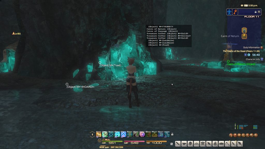
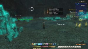
It seems to be the new best method of acquiring Grade V Materia, along with many other rewards.However as we did not anticipate this feature, Hoards appear on 3D Radar as nameless gray circles, which can be hard to notice among traps. So our developers are already implementing a special mode for Palace of the Dead that will make this experience more comfortable and relaxing.
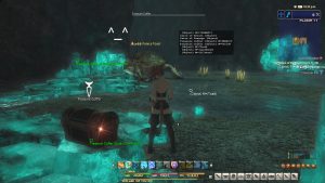
Miqobot will show you all Coffers, Traps, and Hoards without using any Pomanders of Sight/Intuition.
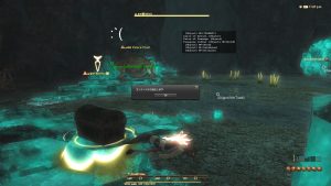
We apologize for debug formatting as this is still a work in progress 🙂In addition, Miqobot will be able to identify Mimics and exploding chests.
October 1, 2016 at 4:28 pm #2203I hope so much that this feature hits beta soon. Ive been using a gathering grid to mark horde locations running floors 1-10 repeatedly and Ive gotten to 35/100 hidden hordes without a pomander achievement and 152 in total, but oh my god this would be so much better and simpler. I do agree with the above stating that you should be able to toggle off living creatures if you like, as they casuse a fair bit of clutter htat blocks the important stuff. Seriously though I’m chomping at the bit for this.
October 1, 2016 at 5:24 pm #2204October 3, 2016 at 3:56 am #2212October 3, 2016 at 4:29 pm #2213Please make an option to turn off players, mobs and such, it’s a usuless clutter on the screen.
Yes please it gives you a headache. Then you see a mob in front of you but no wait its in the next room lol.
This is a great use of the 3D radar. I had not thought to use it in this way before.
Yeah I was using it before the horde on solo runs to avoid traps. Then these little circles popped up.
Another thing I’ve found is sometimes the Hoard is directly on a trap as if the trap itself is the hoard. Not slightly next to it but dead on. I only noticed this when we were using intuition and i couldn’t see it on 3D radar.
October 6, 2016 at 8:00 pm #2227October 7, 2016 at 11:42 am #2229October 9, 2016 at 3:07 am #2242This feature has already been added to the Beta version 🙂
Please try it out!Also, there’s one extra usage of 3D Radar implemented.
When outside of Palace, you can enableGuess objects type (experimental)and useFilter by nameto show only specific entities on the screen. At the moment it works only in Beta version.
Additional options will be available soon.October 9, 2016 at 8:20 pm #2243This is brilliant. As always, you guys listen to the community and come up with a great solution. I’d like to make two suggestions.
1. Color coded traps and chests. I know it’s possible to do this since the regular version of the 3D map codes chests as Green. Perhaps we could return to that and have the Gold, Silver and Copper chests marked as Green and Traps marked as Red.
2. Is it possible to display the list a little closer to the regular map? At the moment, it seems to be a little too in the way. At least for me.
October 10, 2016 at 5:40 pm #2244This is a very good suggestion 🙂
1. Indeed, changing color codes is an easy adjustment and useful as well. We will probably push this into current Beta as a minor update.
2. Adjusting list position on a screen is a bit trickier, but also doable. We will implement this in the form of advanced setting, so you will be able to customize it to your liking.
Thank you for your request very much!
-
AuthorPosts
You must be logged in to reply to this topic.


